Deferred Judgement, Promotional poster
The posters below are for Seung Woo Back’s solo exhibition Deferred Judgement, at the Artsonje Center, Seoul, 2011. The red and blue spot colours work really well with the subtle grey tones of the images and type printed in the background. By colouring the type in the foreground 2 strong tones of blue and red you almost start to view the posters from two layers, separating the colours in your mind.
The posters below are for Seung Woo Back’s solo exhibition Deferred Judgement, at the Artsonje Center, Seoul, 2011. The red and blue spot colours work really well with the subtle grey tones of the images and type printed in the background. By colouring the type in the foreground 2 strong tones of blue and red you almost start to view the posters from two layers, separating the colours in your mind.


B&U- CMYK colour Process
The poster below was produced by the design company B&U, A self explanitory piece of design, simple and effective.
Einstock- Auston Design Group
"Einstök is an Icelandic word meaning “unique”, which is fitting as
the country was originally settled by Vikings and rests on the edge of
the Arctic Circle. Like other northern European countries that endure
long hard winters shrouded in darkness, the Icelandic culture is earnest
and efficient. This characteristic is evidenced in their history of a
clean and minimal approach to design. The Einstök branding and label
design are an effective representation of this northern European
mind-set. The bold sparseness of the package lends itself to strong
billboarding on shelf, which makes it stand out like a beacon in the
highly competitive beer aisle."
I picked these bottle labels and packaging out because of the range of blue tints used, The icey blue in the foreground and other blues look like tints of the the royal dark blue in the background.
Tints: In color theory, a tint is the mixture of a color with white, which increases lightness, and a shade is the mixture of a color with black, which reduces lightness. Mixing a color with any neutral color, including black and white, reduces the chroma, or colorfulness, while the hue remains unchanged.
Tints: In color theory, a tint is the mixture of a color with white, which increases lightness, and a shade is the mixture of a color with black, which reduces lightness. Mixing a color with any neutral color, including black and white, reduces the chroma, or colorfulness, while the hue remains unchanged.


Jonathan Viner Gallery
I picked the Posters out below
because it kills two birds with one stone, The 2 colours used look like
spot colours that have been blended together using a tint. I think they
will have most likely been screen printed, the mix of the two colours
has probably been achieved by using a thinner concentration of binder
and ink.


Noviki-Spot colour + Monochrome
Picked the poster out below because of the combination of monochrome black and
white print and a royal green spot colour work really well, Less is definitely
more. It dind't have a blerb or explanation so therefore its rather hard to
understand its prupose, however I'm very intrigued by what the shapes represent
to in the middle. Your perception is almost twisted by the way the monochrome
sections split out into solid areas of black.

OK-RM
The monochrome photographs are very fixed in terms of layout and in comparison to the type but they work nicely because of the overlapping sections where the colour becomes a different tint.


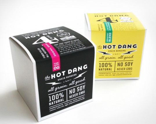
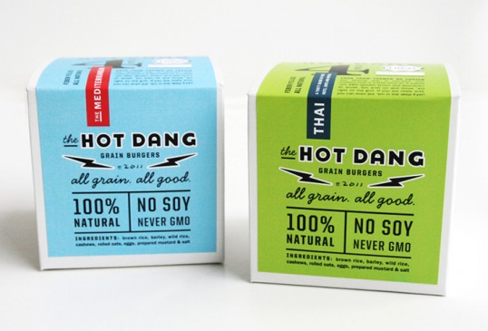
Make and Matter- Hot Dang
CMYK Packaging;